The previous UIS database from 2007 listed the adult literacy rates for 136 countries and territories for years between 1985 and 2005. For 10 countries, the most recent data was from 2005, for 30 countries from 2004, and for 5 countries from 2003.
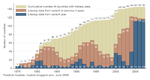
The graph below describes the availability of data on adult literacy in the UIS database as of late May 2008.
- The blue bars indicate the number of countries with data on adult literacy per year between 1975 and 2007. For each country, the adult literacy rate may be available in more than one year. The number of countries with data from a particular year is shown at the bottom of the bars, along the horizontal axis. For example, 115 countries have literacy data from 2007 and 36 countries have data from 2000.
- The brown bars show the number of countries with adult literacy rates from the current year or the previous 4 years. For example, the bar for the year 2007 indicates that 117 countries have literacy data from any year between 2003 and 2007.
- The beige bars show the cumulative number of countries with literacy data from any year since 1975. For example, in 2007, the adult literacy rate is available for a total of 145 countries and territories. The difference between the beige and brown bars in 2007 is the number of countries with the most recent literacy data from a year before 2003. The difference between the beige and blue bars in 2007 is the number of countries with the most recent data from a year before 2007.

Source: UNESCO Institute for Statistics, Data Centre, May 2008
Related articles
- UNESCO releases data from 2007 education survey
- Adult literacy rates
- Youth literacy rates
- Disparity between adult and youth literacy
- Disparity between male and female literacy rates
- Adult literacy in Sub-Saharan Africa
Friedrich Huebler, 1 June 2008, Creative Commons License
Permanent URL: http://huebler.blogspot.com/2008/06/uis-literacy.html
My commnent is slightly off topic. Whenever I visit your website, I'm always very much impressed by your wonderful charts.
ReplyDeleteI find it extremely difficult to create readable stacked bars in STATA, such as this one. Would it be possible to publish the STATA code on your website?
Greetings
Jur.
Jur, the graph above is not really a stacked bar chart, it only looks line one. It is a combination of bars that are drawn on top of each other, with the taller bars drawn first and the shorter bars drawn last, so that the short bars cover a part of the tall bars. Here is an example using one of the datasets that ship with Stata:
ReplyDelete. sysuse lifeexp
. twoway (bar total agegrp) (bar maletotal agegrp), legend(label(1 "Female") label(2 "Male"))
In the example, the bars indicating total population by age group are drawn first. The bars indicating male population by age group are drawn next, partly covering the bars with the total population. The result is a graph that looks like stacked bars with the male and female population by age group.
Thanks for the explanation. It is very helpfull.
ReplyDeleteGreetings.
Jur.
Yes, very nice graphs indeed. But I think you had a typo, I guess you mean -sysuse pop2000- since lifeexp do not have the variables total or maletotal.
ReplyDeleteRichard O.
Thank you, Richard. You are right, I made a mistake. Here are the correct Stata commands:
ReplyDelete. sysuse pop2000
. twoway (bar total agegrp) (bar maletotal agegrp), legend(label(1 "Female") label(2 "Male"))